CRYPTO TRADING & POKER SYNERGIES
There are many synergies between the worlds of online poker and crypto trading. Designing products and experiences for online poker and crypto trading share many similarities. Both are data rich, domain specific environments, infused by opportunity and the competitive edge. Both systems involve an element of risk which require users to have a certain level of skill and knowledge to succeed. And both are time pressured environments, increasing the potential for catastrophic user error.
Poker and crypto trading share similar demographics drawn by the appeal of the competitive environment and opportunities to gain an edge through knowledge and strategy. Balancing the ecosystem for liquidity is crucial for both systems, with diverse user types like fish, sharks, and whales bringing different behaviours and strategies for long-term sustainability.
This is the story of my experience designing and building a crypto native, e-sports inspired poker app from blank page to proof of concept beta build.
")
Background
Zk Poker, a crypto native and e-sports inspired desktop poker app was conceived to merge the worlds of poker and crypto. It was a high-risk startup experiment to create a proof-of-concept poker product leveraging the border-less payment possibilities and unification potential that crypto offers, as well as the potential for financial engineering using crypto smart contracts such as yield farming, staking and tokenomics to infuse the poker experience and engage younger generations of players.
Pitched as e-sports friendly whilst remaining true to online poker, it was designed to target and appeal to a younger generation of players by subtle introduction of concepts from e-sports and other gaming types.

")
This is the story of my experience designing and building a crypto native, e-sports inspired poker app from blank page to proof of concept beta build.
To understand how cryptocurrencies as a store of value can impact a multitude of areas across product development, check out my Designing for Cryptocurrency case study.
Goal
The aim was to design a poker experience that felt natural as traditional poker but with additional features that captured the essence of the new crypto era, to leverage crossover audience appeal between the two markets. As a small, agile start up team, the ultimate goal was to produce an MVP desktop poker client in preparation for a private beta phase.
Role
As a founding member of the team, I was responsible for all aspects of the product design of the poker client from the ground up. Initially, I started with one developer and progressed to two junior UX designers and a senior art designer. As a distributed team we collaborated remotely, operating in different time zones and languages. Enabling clear communication on the product design between team members was essential to ensure efficient coordination and speed of progress.
GAME WORLD OVER TABLE GRIND
RISKS
NEW CONCEPT OLD FRAME

We started with the ambition to create the new era of poker, leveraging innovations from wider gaming concepts to appeal to new generation of players. Our aim was to deliver an immersive poker experience that would reinforce the sense of fun and absorption back into the poker game experience. However, if we focussed singularly on the new concepts without enough attention to the traditional software UI frame we would run the risk of negatively impacting the new offering.
RISKS
Avoiding FISH BLOODBATH in the New Era

We need to be appealing enough to gain the attention of recreational players and provide enough of an incentive for them to overcome the barrier of entry. Key to this was navigating the risk of “Fish Massacre” – inadvertently creating a system resulting in high bust and churn rate. Instead we placed the player ecology at the core of our offering and integrated innovations into features and game play to change key factors of the usual cycle to reduce the speed of churn, resulting in a healthier ecosystem and better player experience.
Capturing the vision
Sketching Core Functionality
Setting off at speed
Working in a distributed team in varying locations time schedules, languages and working together for the first time, coherent communication and consensus on the design was crucial. The team urgently needed clear blueprints to start working on the front end, with the goal of getting something to t-shirt size and schedule as quickly as possible.
Through “quick and dirty” low-fidelity sketches and prototypes, I was able to communicate effectively with the development team, gather feedback early and often, and establish a consensus and common language. This allowed efficient work with the development team.
Minimum Viable Product Vs Minimum Lovable Product – The Beta Debate
I quickly transformed my notes into visual sketches, bringing the vision to life and outlining the product features. This allowed the team to have a rapid overview of the product and it became more tangible.
During this process, we discovered some areas where consensus was lacking and encountered some key questions not yet considered.
To identify which features to prioritise I centred team approach around MVP vs MLP (Minimum Lovable Product) create a general overview of the beta build feature set.
This strategy enabled the team to focus our efforts and set priorities based on which features were essential versus nice-to-have.
")

Capturing The Vision
DEFINING The Mission
Defining our Mission
I utilized Experience Values as a framework to define the story of our mission as a product team. As a tool, the process of defining Experience Values would foster a shared understanding and agreement on our collective vision, and act as an ongoing resource that each team member could return to as a reminder of our primary group goals.
The values serve as a guiding beacon for the product development journey, allowing the team to remain focused on our core objectives throughout the winding path and pressures of product delivery.
Experience Values
Product Offering as a Relationship with customers
A product can be viewed as a relationship and a set of promises made by an organization to its target audience. Converting audiences into customers requires that players offer their trust and loyalty with the implicit understanding that the product will provide the desired benefits and perform as expected. That relationship exists in the customer’s mind, and customer loyalty implies owning that relationship to the exclusion of competitors. Key to this was the question of how we would tell, and how well our target audience would understand the story of our product offering.
Experience Values
Product offering as Collective identity
The goal was to define a story that players would identify and aspire to be a part of, a community they want to join. The Experience Values would serve as an anchor of identity for our target audience. To be effective, my approach was to not simply dictate, but to build a collective identity in partnership with our players.
To do this, I created a design sprint consisting of a series of workshops with a team of poker pros, mix of independent cash players and stable based tourney players.
THE STATUS QUO
The aim was to gain a deeper understanding of status quo to draw from as a source of feedback and data and to validate the assumptions we had made regarding the benefits and unique offering of our product, as well as our competitive advantage in a crowded market. I wanted to explore how players would perceive and understand the offering from their perspective. To do this, I developed a set of questions to workshop and gather insight from representative players.


Rooted in The Source – Why we play
In building the new era, our goal was to reinforce the sense of fun and absorption into the game experience whilst remaining faithful to the authentic poker experience. Key to the vision was a return to the “fun” and enjoyment of the game. To remain rooted in this source and avoid straying too far, I worked with the players on this theme. The exercise and overt statement served as a conscious guide to stay aligned, and also as a benchmark to gauge our progress over time.

The HVG experience in current era
The importance of humility and collaboration in design
With a wealth of collective past experience in the field, the founding team felt we already held substantial insight into the market. Nevertheless, working with players through the workshops led to a more profound comprehension of our key users. The sessions unearthed unexpected insights into unmet needs and provided us with a deeper understanding of their viewpoints in the current landscape.
“Players are tired of being judged as if they were gamblers…in my opinion, some are trying to change the aggressive/toxic behavior. I definitely identify myself with these sentiments expressed…”
“Being an online pro for sure has some downsides, requires sacrifices, and it’s solo work. I think in some way that’s why players gather mostly with poker players. We don’t talk about this stuff openly overall, still, there are groups who are starting to share these kinds of thoughts, bringing consciousness. I believe it’s a positive approach…”
“Online poker pro is kind of an isolated life, I have friends who broke relationships because of the “poker grind lifestyle” and I found it hard to deal with it in the first 2 years, but then I got used to the routine and I develop a kind of routine “for one person” it’s not lonely, but it is activities that you do all alone. …”
The simple question of “What’s it like to be a HVG in the current era?” uncovered key themes around current experience. Gaps in a sense of community and connection, a lack of former pride and prestige of being a professional, and the need for sovereignty and trust.
What matters in The New Era in Online Poker
As we progressed we began to build a clearer picture of “The New Era of Poker” from the perspectives of our key target audience.


How we get there
Articulating Our Mission – Experience Values
To capture the insight we had gained through the workshops, I synthesised the output and distilled into a playbook of experience values. This playbook served as a crucial reference point for the team, guiding them through the product design journey.

Audience
MEMBERS OF THE NEW ERA
Members of the new era
To focus objectives on a balance between business needs and user needs, I worked with the team to sketch “living” personas. These personas served as a reference point to capture key behaviours and further define player needs, helping the design team to clarify our goals through the product design process.
")
Game World Over Table Grind
Table as the centre of gameplay action
With the table as the core UX – the “battlefield”, centre of action – we focussed efforts on bringing a video game world immersive experience to the poker table.
This was an amazing opportunity to review the status of the current offering in the market, and then completely rebuild a better online poker table experience from the ground up.
WHAT MAKES A GOOD ONLINE POKER TABLE?
Poker table design as a science
Designing a table may seem simple, but poker table design is a visual data design science mixed with a splash of magic.
Poker tables are the epicentre of data intense, value/money centric, time sensitive user environments with multiple dynamic states, where high value stakes can be at play and the risk of error can be catastrophic.

More than designing 1 good table
Primed to how players play
Poker table design is not just about designing 1 good table. To support the range of players necessary for a healthy ecosystem, table designs must be optimised to how different player types play.
Table design must be optimised for the recreational casual single table player, who may prefer to maximise the view to a full screen mode, as well as for the High Volume Grinders who likely have multiples of tables open and active at any one time.
")
Extreme Requirements
The functional requirements of a poker table are extreme. Designs need to work for:
- Different game types (e.g. Omaha) and functions, like run it twice, displaying different numbers of cards
- A variety of table sizes and positions from 6 player or 9 player full tables, to heads up situations with only 2 players seated
- Numerous game situations such as split pots,
- Multiple customisation options e.g. card face formats, table felt & background colours
- And all functions need to be structurally and visually clear in resizable formats for minimum window sizes.
Carefully balanced
With the requirement of making time sensitive dynamic options available on top of each state unobtrusively, table design is not about designing graphical components in isolation of each other.
Each component has a knock on effect on others, and structure and visuals need to be carefully balanced to support the information hierarchy required, at any one point in time, for multiple time sensitive dynamic states.
Co-Designing with Players
The design team I led included 2 former poker pros who were now UX designers. This increased the speed of the design process exponentially. Acting not just as designers, but also as sources of data and continual in-process feedback, their backgrounds were key to bringing the designs to life.
I split the table design process into 2 phases to enable focus on in stages with the aim to better analyse every single aspect with a deeper focus. The first focussed on structural design and the second on style and colour.
Challenging the Status quo
&
Rebuilding from the ground up
This was an amazing opportunity to review the status quo of poker table design in the market, and then rebuild from the ground up.
As online poker is a fast moving industry, the process was an important step to refamiliarise the team with player expectations and the heuristics our target audience were already familiar with. It also provided an opportunity to review from HVG perspectives, and the space to reflect on what they liked and didn’t like about existing tables and to hone in on preferences for table designs overall.

CAPTURING FUNCTIONS & DYNAMIC LAYOUTS
We started by defining basic elements necessary for a functional table. For dynamic elements we mapped their appearance to events and user action options, and sketched approximate locations.

STRUCTURAL DESIGN
We then started work on structural design. The main focus was to set up a solid structure that defined proportions and size of the main elements. This involved coordination of elements in resizing the view from minimum window size right up to a maximised view.
To achieve this we needed detailed work on proportions between the elements within the window and relative sizings.

Structural hierarchy
There is a lot going on in a poker table at any one time and when working with multi-table situations, highlighting the right information at the right time is key to good poker table design.
Key to creating a really effective structure, was the process of working through each element and identifying the information hierarchy at each stage.
For each different dynamic state of the table, we looked at it through the lens of user needs, asking not only what are the key elements to highlight at each stage, but what is the hierarchy to that list of elements.

Chips positioning study
Table structure finalisation required extremely detailed work on chips and dealer button position scenario mapping. Steps required scenario analysis, mapping worse case scenario placements, identifying visual space conflicts and illustrating the positions and rules for dev.

The work we did included identifying standards for the rules around how chips visuals work.
We needed to identify the visual location for each element for each round of betting, including bets, main pot, layouts for side pots, animations for split pots, as well as rules for raising, rules for re-raising and rules for re-re-re-raise (5bet).
This work needed to be completed not just for 6 player tables, but also 9 player.
CARD FRONTS – DEEP DIVE
Although a large chunk of my design career is in online poker, designing card fronts from scratch was an education in itself. I had not appreciated before the depth of detail to design options for card fronts.
For this product, we primarily focussed on giving the best cards and table experience for the beta MVP offering which was Hold’em only. Working on the assumption that we would provide a new set with an Omaha launch if required, we reviewed Omaha card structure requirements so that we could accommodate changes to spacings needed for the increase in card numbers.

Card face structure & design study
Some of the options we explored were pips placement, value centric vs suit centric, vertical layout, horizontal layout, white vs solid colour backgrounds, colour variations, and various fonts as an experiment with modern style.
For MVP we decided on a classic style, simplified card format, and player options of 2 and 4 colour decks.
In addition to the designs themselves, visuals then required polishing for effect, including spacings, shadings for clarity, and “sheening” effect amongst others.

Thematic Style and Colour
Phase 2 of table design focussed on style and colour.
Before starting we needed to consider the existing colour structures involved in the table mapping to information hierarchy, integration of functional colours (such as red for timebank) and to consider colour balance when reviewing in context with card front and chips colours.
It was only after we had done this that we were able to explore stylistic themes for the table such as styling for the player action buttons. Using a simplified plain button format to start had enabled us to focus on that work without becoming distracted by stylistic elements.
For action buttons specifically, we explored several themes and reviewed in context of scenarios where many of the functional colours were on display.

Snagging & Polishing
Once colour, style, shape, colour balance were considered and the visual styles agreed for the various buttons, further snagging and polishing was completed in a continuous process of refinement for optimal player experience.

How to design “good” table Chips
As with most elements on a poker table, there is more to chips design than the visual design of a single chip.
Colour standards for chip value are important to adhere to. Strangely though, we discovered that there are no “official” standards for chip colour values, however conventions and heuristics do apply. Additionally for consideration were colour shade and variations options.
Perspectives and shading for realism of experience were key to authenticity of visuals for stacks (how the chips appear when stacked each chip on top of another).
We also needed to identify the micro animations and sound effects and rules for combining bet stacks into the pot, as well as for rounds of raises and re-raises.

A Continuous process of refinement
Balance for optimal player experience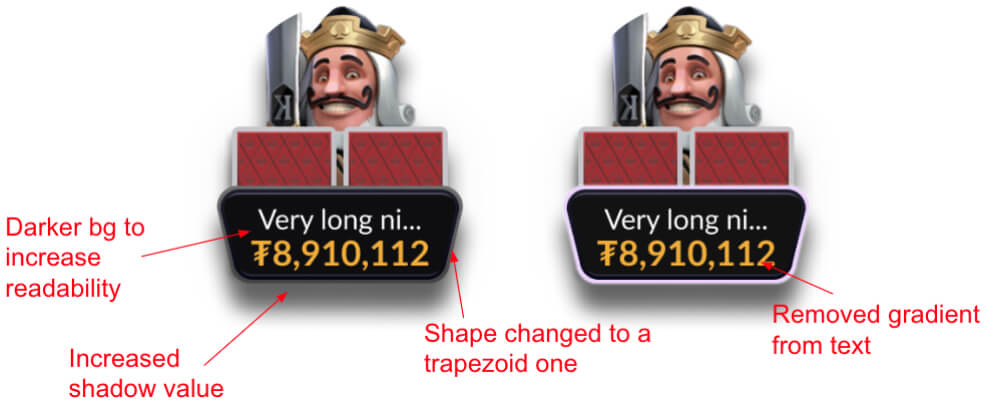
Other items for table design included;
- Table felt colour, style, shape
- Nameplate shape, styles and colours for various states
- Card backs styles and colours
- And backgrounds for the table window including colour, texture and final details.
Ensuring balance in combining all design elements required an intense continuous process of refinement to achieve optimal player experience.
The options we provided in the MVP pack were vibrant and dark mode, with options for 2 colour and 4 colour deck.
Table Vibrant Mode

Table Dark Mode

Lobby
Less is More
With our mission being a table centric UX, our goal for lobby design was to create a design that facilitated and encouraged users to spend more time at the tables and less time in the lobby.
Private Beta Strategy
Managing change upfront
For users, change in familiar territory always brings some level of pain and our private beta centred on HVGs, experienced players. HVG players are usually super opinionated in feedback, and being high intensity users, in order to reduce perceived friction for the beta phase, the team felt it was important to provide a traditional poker lobby experience for the first pass.
To start I sketched up designs following conventional formats, including filters, list view, group view, for cash and zoom type lobby and captured the necessary features and functionality.

Play world over table grind
Once the basic structure of the lobby was agreed, we focussed on theme and style.
Moving from functional list to play world I worked with an art designer to explore themes of fantasy gaming, esports, classic and futuristic.
With the overall focus to provide crystal clear user flow to the tables, the aim was to keep the traditional while signalling an immersive table world.

REFINING
Once chosen the visuals went through a process of refinement to optimise each element.
Designs for beta included vibrant and dark modes, with dark mode echoing a more traditional experience and vibrant mode a more playful feel. These user options for private beta would provide the team with useful insight into player preferences on theme progressing to public beta.

Lobby Dark Mode

Lobby Vibrant Mode

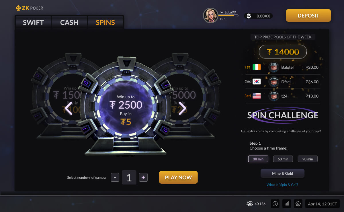
Next Gen SPINS


Spins
Spin lobby provided the opportunity to stretch the virtual world theme considerably.
Sketches to motion
In moving from sketches to visual we were able to explore advanced animations.
The final design included motion to enhance the theme.

Spins Lobby

Gallery